
Children’s Discovery Museum of San Jose

OVERVIEW
The Children’s Discovery Museum of San Jose wanted to update their experience for today’s families while keeping the hands-on, human feel that makes the museum special. As visitors’ expectations around digital experiences grew, the museum needed a better understanding of who their audiences are and how to modernize both their website and the in-museum journey.
We focused on three main goals:
• Personalized learning by shaping exhibits and digital touchpoints around different age groups and interests
• More engaging experiences by using technology to spark creativity, problem solving, and collaboration
• Stronger global connections by tying exhibits to real-world topics like community, environment, and civic awareness
Over six weeks, our team partnered with the museum to review visitor behavior, identify key growth audiences, and shape a future-facing experience strategy grounded in both data and creative thinking.
I was part of a three-person design team responsible for turning research insights into tangible ideas for the website and in-museum experiences. While two designers led research and strategy and our Creative Director handled client communication, I focused on execution. I translated findings from stakeholder interviews, UX reviews, and audience segmentation into clear digital improvements and experiential concepts. We also explored how tools like AR and Generative AI could make the museum experience more interactive while still keeping it accessible and playful.
-
UI Designer
Owned execution of website concept directions, turning research and segmentation insights into cohesive UI systems
Designed responsive layouts, navigation patterns, and visual hierarchies across desktop and mobile
Supported innovation concept development and client-ready presentations
-
Figma
Adobe Firefly
-
Engagement Leader
Creative Director
UI Designer
UX Designer
UX Designer
Creative Strategist
-
6 Weeks
THE PROBLEM
A children’s museum in California wanted to better understand its visitors, members, and donors to improve engagement and modernize its experience. This included updating the website and exploring new technologies like AR and AI to enhance exhibits and marketing.
While the vision was clear, the path forward was not. The museum aimed to create a more personalized and engaging experience, but lacked the structure and insight needed to bring that vision to life.
Several challenges made this difficult:
Audience data was spread across different sources, making it hard to form a clear picture of who their visitors were
The website mainly provided information, but did not actively drive attendance or membership
Ideas for new technologies were promising, but not grounded in real audience needs
Without alignment, there was a risk of investing in features that felt innovative but did not meaningfully improve the visitor experience.
The museum needed a clearer understanding of its audiences and a practical way to turn insights into action.
THE SOLUTION
We started by understanding who the Museum serves. Using location and membership data, we identified key visitor groups and what matters most to them.
We combined these insights with an evaluation of the current website and digital experience to find opportunities for improvement. This helped us define how the experience could better support discovery, engagement, and repeat visits.
From there, we created a clear direction for modernizing the experience. This included improving the website’s structure and usability, while also exploring how emerging technologies like AR and AI could enhance exhibits in meaningful ways.
Key outcomes:
Clear audience segments based on visitor and membership data
Website UX recommendations to improve navigation, hierarchy, and calls to action
Concepts for using AR and AI to enhance exhibit experiences
A unified vision for a more engaging and personalized visitor journey
The approach focused on using technology to support curiosity and learning, not distract from it.RESEARCH
DESIGN APPROACH
We combined audience analytics, heuristic evaluation, and creative exploration to shape a modernization strategy across digital and physical experiences.
Using the Four Fs framework — Form, Flow, Feeling, and Function, we evaluated the current website and identified opportunities to improve clarity, navigation, emotional resonance, and task completion.
We then developed multiple website directions alongside experiential innovation concepts, testing how different visual systems, storytelling approaches, and emerging technologies could better support priority audiences.
The result was a balanced strategy aligning data-driven insight with imaginative, human-centered execution.
Website Concepts
Designing the First Impression
The website serves as the Zero Moment of Truth — shaping perception, influencing attendance, and guiding planning decisions.
We explored three strategic directions instead of proposing a single redesign.
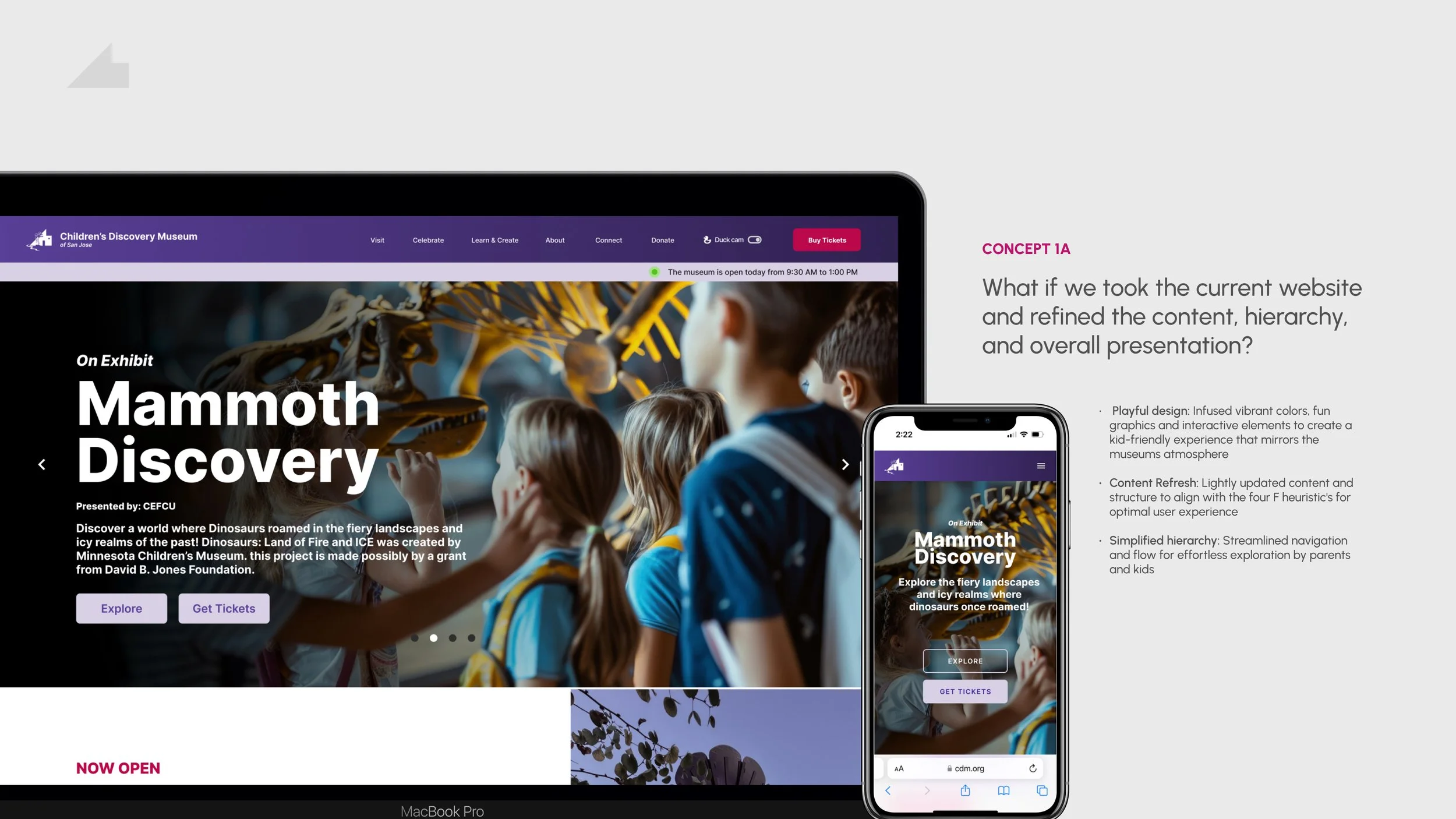
Direction 1: Guided Discovery
Concept A – Content-led
Focuses on strengthening hierarchy, clarity, and navigation while maintaining familiarity.
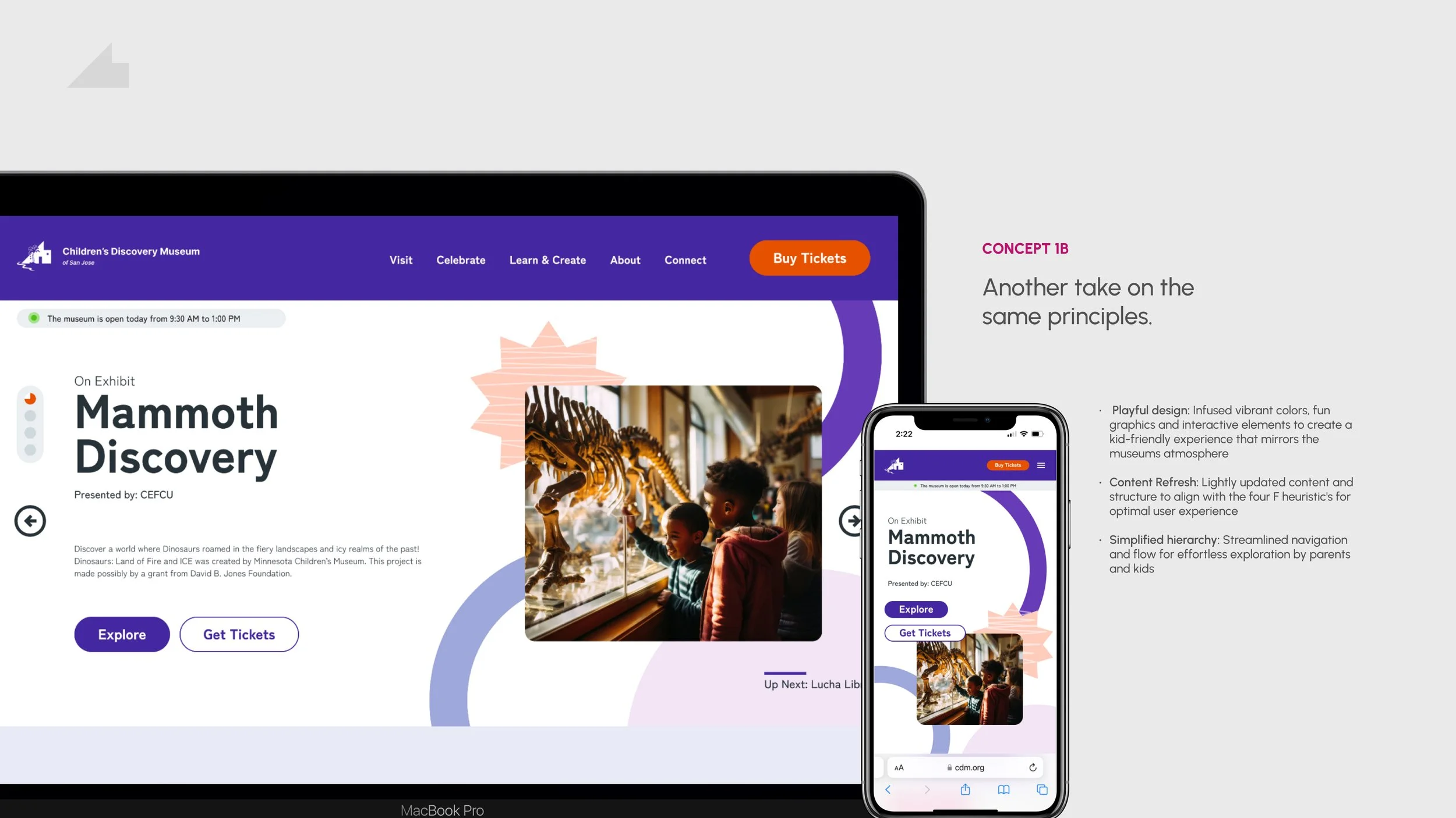
Concept B – Plaful Brand Expression
Applies the same structure with stronger visual personality and engagement cues.
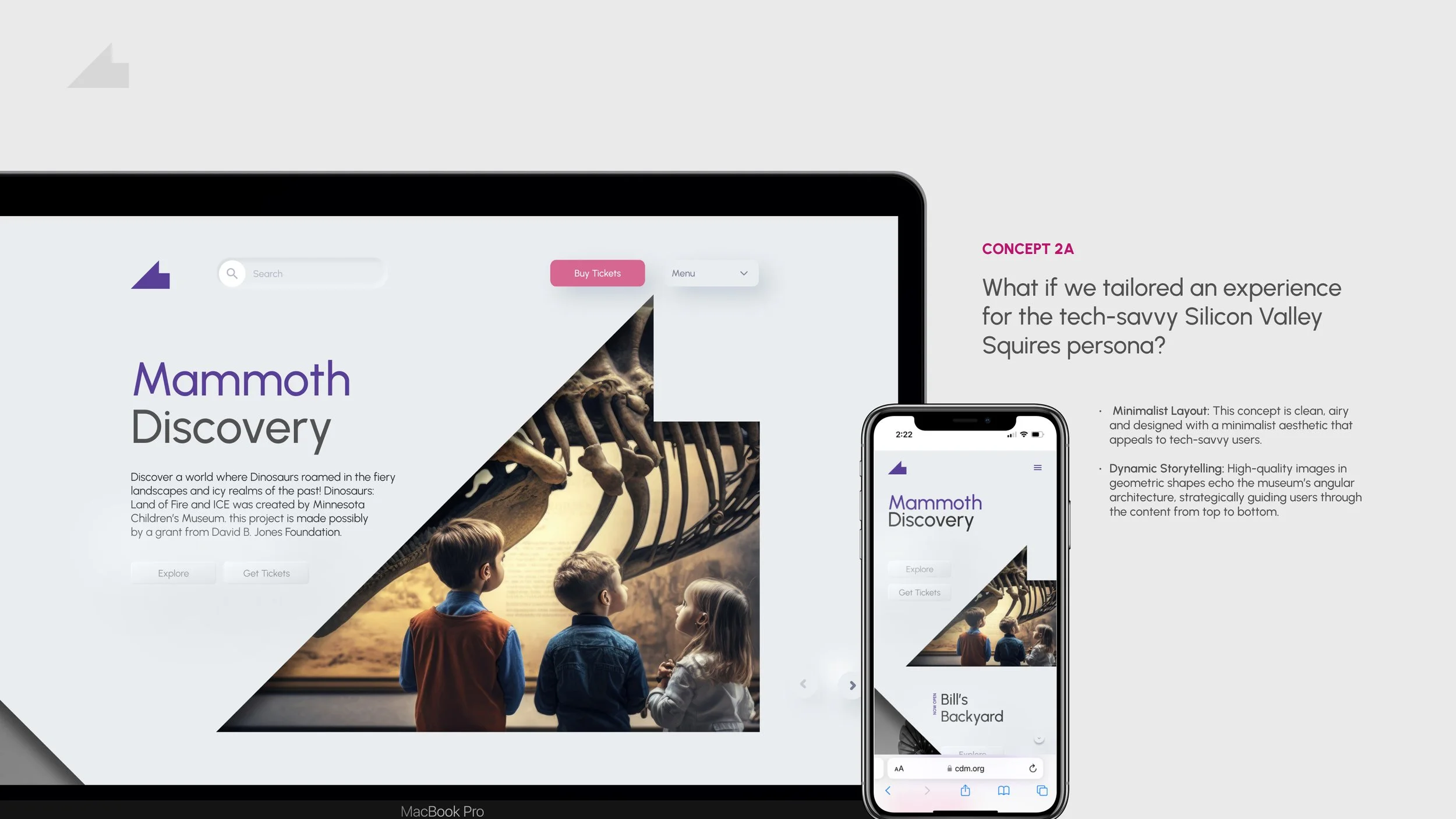
Direction 2: Modern Museum
Concept A – Architectural Minimalism
Focuses on clean, structured layouts that reduce visual noise and highlight content through strong hierarchy and geometric composition.
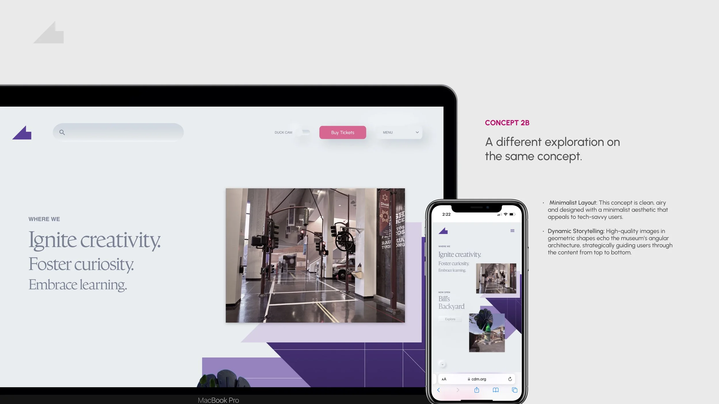
Concept B – Spatial Storytelling
Applies the same minimalist foundation while using layout, scale, and imagery placement to guide users through a more narrative, gallery-like experience.
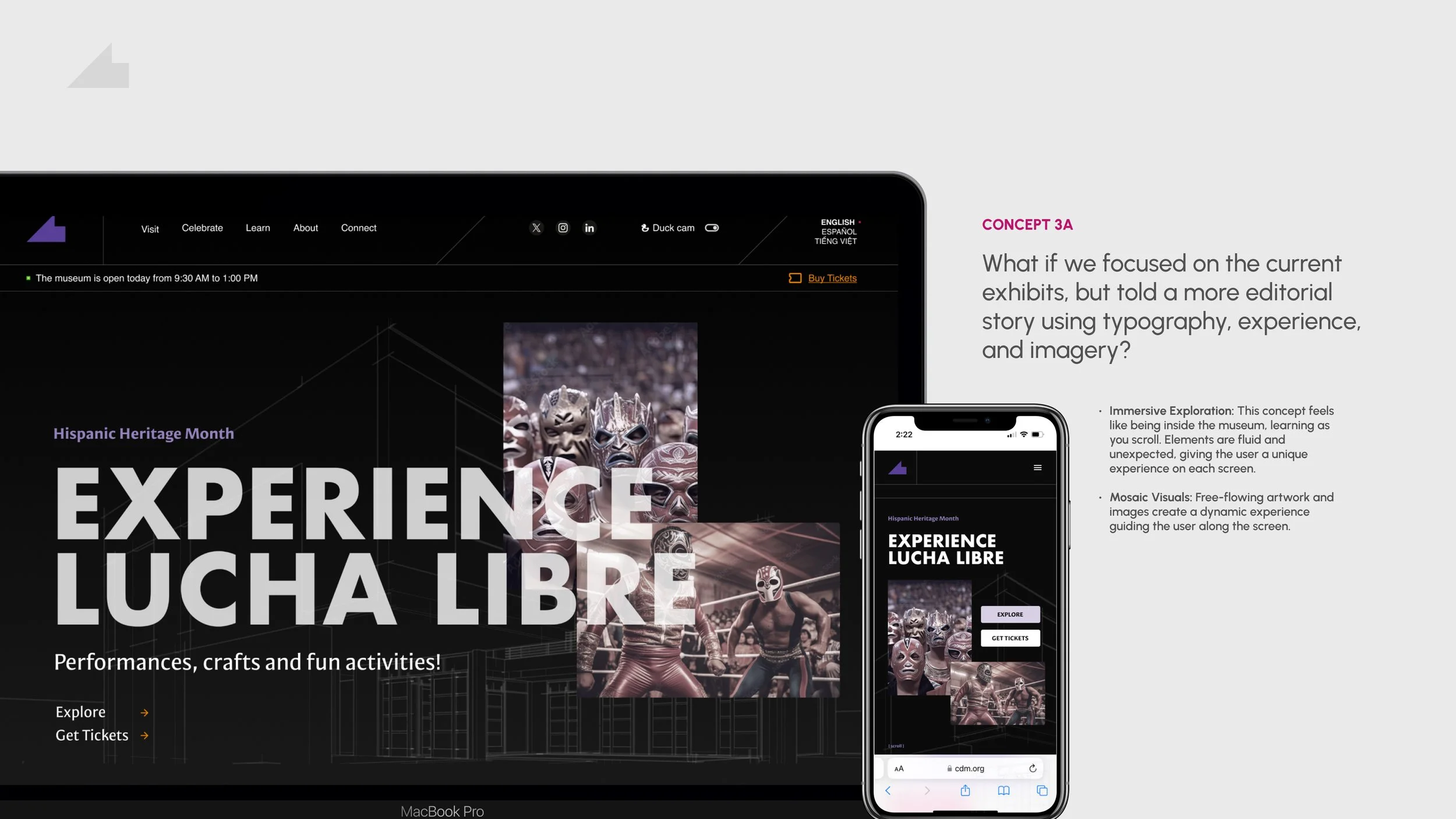
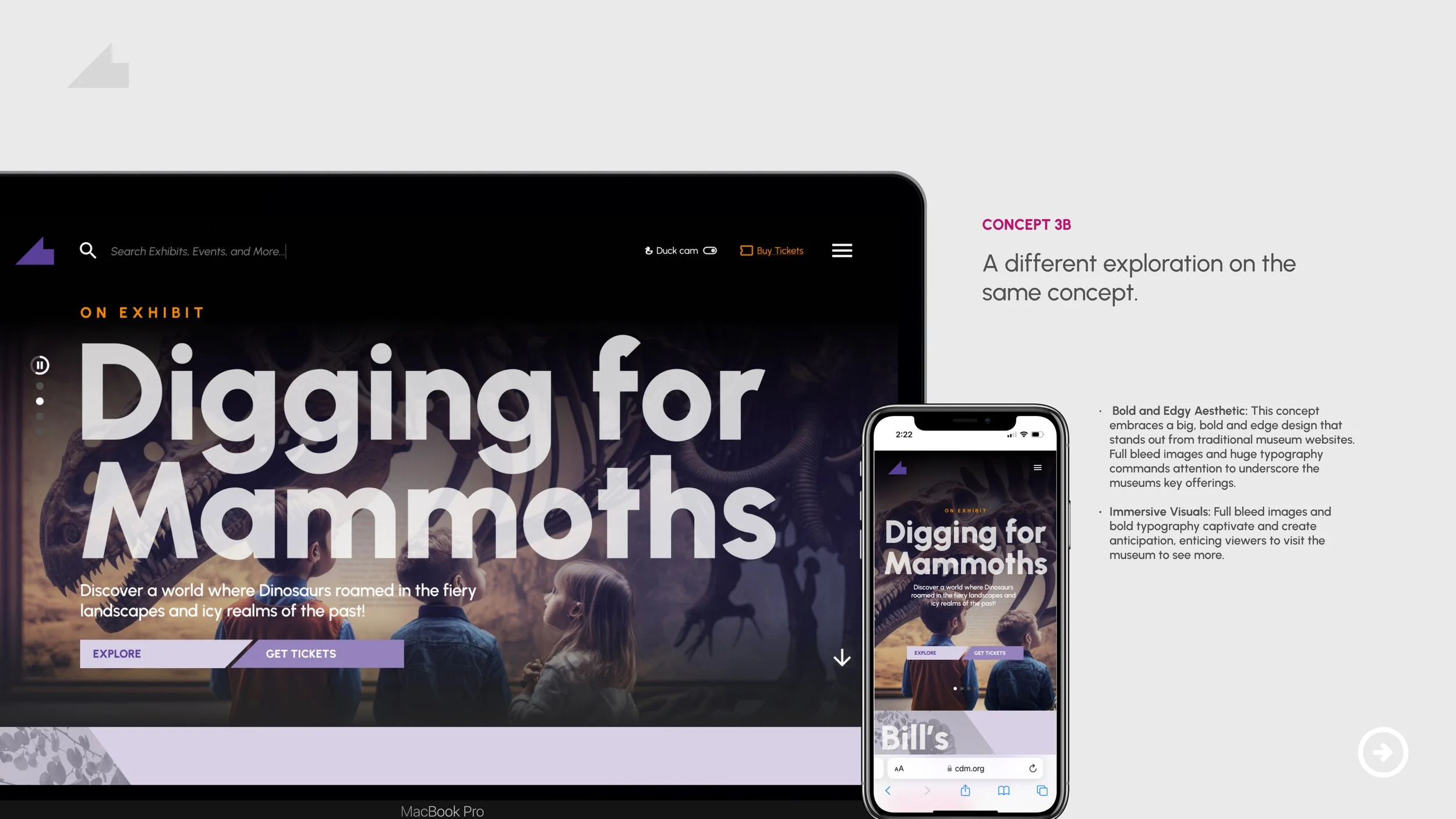
Direction 3: Inside the Exhibit
Concept A – Editorial Immersion
Uses bold typography, full-bleed imagery, and layered storytelling to create a sense of exploration that mirrors the emotional energy of being inside the museum.
Concept B – Cinematic Expression
Builds on the immersive foundation with more dramatic visual contrast and motion-inspired composition to heighten anticipation and encourage visitation.
Creative Ideas
My Museum BFF

What if parents and guardians invited their children to create their own personal guide to the museum?
Using the concept of an imaginary friend, children can use genai to create the name, species–everything–before you leave your house. When you get to the museum, your BFF is there waiting for you at the entrance, just as you had designed them. Children can explore the museum as they wish, while their parents use their mobile devices to surprise their children with the BFF they created. Who knows, their BFF might even be waiting for them on the website when they return.
-
Initial Visitor Onboarding
Customization Kiosks
Interactive kiosks at the entrance allow visitors to create their BFF by selecting species, name, and appearance through child-friendly touchscreens.Profile Integration
A backend system stores visitor profiles, linking to memberships when available so BFFs persist across visits and at-home engagement.Interactive Museum Touchpoints
Beacon-Triggered Moments
Bluetooth beacons activate exhibit-specific BFF interactions on nearby screens or museum devices as visitors move through the space.AR Experiences
At high-engagement exhibits, AR enables BFFs to explore objects, animate concepts, and guide learning moments.Personalized Exhibit Guides
AI-Driven Recommendations
AI tailors exhibit explanations and suggestions based on visitor preferences, maintaining playful, age-appropriate dialogue.Gamified Prompts
The BFF encourages participation through challenges and discovery-based questions.Interactive Zones
Motion-Based Play
In activity areas, gesture or motion sensors allow BFFs to “play” or move with visitors.Projection Mapping
Projection brings BFFs to life on walls and floors for immersive, shared interactions.Post-Visit Engagement
Farewell Stations
As visitors exit, BFFs recap the experience and prompt continued engagement.Digital Companion
Members access their BFF through an app or website to extend learning, earn rewards, and receive updates on new exhibits.Membership & Return Engagement
Exclusive Customizations for Members
Unlock additional BFF features, such as outfits or abilities, to incentivize membership and repeat visits.Event Invitations
BFF-driven notifications invite families back for special events, new exhibits, and exclusive member experiences. -
Apple
Why
Apple’s ARKit technology could be the foundation for the augmented reality aspect of the BFF, allowing the character to “come to life” within the museum using AR on visitor’s devices or museum-provided iPads. Apple could also provide the physical hardware (iPads, Macs) used at customization stations or for interactions throughout the museum.
How
Apple can provide grants or discounted iPads to be used throughout the museum, creating AR moments where visitors see their BFF projected onto the physical environment (e.g., dancing by an exhibit). They can also provide educational resources for coding and AR development, incorporating STEM learning for kids.Google (AI and AR Solutions)
Why
Google is heavily investing in their AI and AR development. Their AI capabilities can enhance the BFF’s ability to interact intelligently with visitors, adapting responses based on the visitor’s preferences or past interactions.
How
Google could integrate their AI tools (like Google Assistant) to allow the Museum BFF to engage in natural conversation and recommend personalized content or routes within the museum. Google Maps AR could assist with navigation throughout exhibits, or Google AI could be used to personalize exhibit recommendations based on a visitor’s prior museum history. -
High: 18-24 months
Full-scale rollout with advanced AI, dynamic AR experiences, and deep integration with museum exhibits. Includes planning, testing, and refining based on user feedback.
Medium: 12-18 months
Focused on core BFF features and a select number of interactive touchpoints. Allows time for initial testing and user feedback.
Low: 6-12 months
Pilot program with basic BFF interactions, limited customization, and a few key locations. Rapid testing and feedback to shape future iterations.
The Storybook

What if children could write and star in their own story, by just experiencing the museum as a child would?
Imagine their parents starting with the basics when they buy their tickets: age, name, and general appearance, and technology does the rest. When the children arrive at the museum, using wearable technology, a digital memory is created for them to revisit online. More than just a record of events, the story is written like a children’s book with chapters of current locations – and every visit is unique.
-
Wearable Technology Integration
Smart Wristbands: Each child receives a “high-tech” wristband that tracks their journey through the museum using RFID or Bluetooth. Offering a seamless experience that logs interactions without being intrusive.
Data Capture & Privacy: The wristbands capture key data points (exhibits visited, duration, interactions) while adhering to privacy standards, ensuring a safe and secure experience for parents who prioritize data security.
Story Generation PlatformAI-Powered Story Creation: Using AI, the platform generates a personalized narrative for each child based on their journey through the museum. The story adapts to not only the child’s personal information, but also their behavior.
Cloud-Based Access: Parents and children receive a digital link to access their personalized storybook online, allowing them to revisit and share their memories.
Interactive Exhibit IntegrationExhibit-Specific Story Chapters: Each chapter of the storybook is directly tied to the exhibits visited. For example:
Dinosaurs: Land of Fire and Ice: The child’s story includes a chapter where they become a junior paleontologist, discovering fossils and learning about the Cretaceous period.
Bill’s Backyard: The storybook includes a chapter where the child is an adventurer climbing trees and exploring nature, mirroring their experience in the outdoor exhibit.
WaterWays: A chapter could revolve around a magical journey where the child controls water currents and learns about the science of water flow.
Interactive Digital Storybook
Customizable Avatars: The child’s avatar, created based on the details provided at ticket purchase, stars throughout the story.
Engaging Visuals: The storybook is designed with vibrant illustrations and animations that reflect the exhibits’ themes, appealing to kids and parents.
Dynamic Exhibit-Based ChaptersReal-Time Story Updates: As children move through the museum, their story is updated in real-time, creating chapters that reflect each exhibit. This allows for a storybook that captures the exact sequence of their journey, ensuring every visit feels fresh and unique.
Interactive Add-Ons: After their visit, children can add digital “stickers” or extra pages to their story, like adding an imaginary friend they made in the Wonder Cabinet or expanding on their adventure in the Mammoth Discovery! exhibit.
Gamification & Story RewardsAchievement Badges: As kids explore different exhibits, they earn digital badges (e.g., “Dinosaur Explorer” or “Bubble Master”) that appear in their storybook, providing a sense of accomplishment.
Enhanced Content for Return Visits: Returning visitors can unlock new storybook chapters or bonus scenes that build on their previous adventures, such as a special hidden fossil in the Mammoth Discovery! exhibit or a secret path in Bill’s Backyard.
-
Apple
Why
Apple’s expertise in wearable technology and seamless user experience design makes them a strong partner for the wristband integration and storybook platform.
How
Apple could provide the tech infrastructure for the RFID-enabled smart wristbands, leveraging their experience with Bluetooth and IoT devices to ensure seamless data transfer and integration with the storybook platform. They could also support app development for accessing the digital storybook on iOS devices.Google
Why
Google’s strengths in AI and cloud computing make them ideal for powering the AI-Powered Story Creation and Cloud-Based Access components of the storybook experience.
How
Google could provide access to AI tools that help generate personalized narratives based on each child’s interactions at the museum. Their cloud services could host the storybooks, offering secure and scalable access for families.Adobe
Why
Adobe’s creative software and design expertise are crucial for creating the Engaging Visuals, Customizable Avatars, and Interactive Digital Storybook elements.
How
Adobe could provide access to Illustrator and Photoshop for designing vibrant storybook pages, as well as tools like Adobe InDesign for creating the digital layout of the storybook. They could also offer software for parents and kids to add digital “stickers” or customize their story post-visit.Cisco Systems
Why
Cisco’s focus on secure data transfer and network infrastructure makes them a valuable partner for managing the Data Capture & Privacy aspect of the wearable technology.
How
Cisco could help implement secure data transfer for the RFID wristbands, ensuring that data collected from the child’s journey is encrypted and safely transmitted to the story generation platform. They could also support the development of a secure app for parents to access their child’s digital storybook. -
High: 18-24 months
Complete rollout with detailed app functionality and extensive planning, testing, and feedback adaptation.
Medium: 12-18 months
Focused on core locations and exhibits, allowing for basic development and pilot testing.
Low: 6-12 months
Pilot program with simple interactions, rapid development, and initial feedback to guide improvements.
The Boredom Button

What if there was a way to lead people TO the museum using new technology at places around San Jose where people tend to wait?
What if there was a way to lead people TO the museum using new technology at places around San Jose where people tend to wait? The trolly/streetcar/bus stations? The fountains. Crosswalks. At these locations, there could be an oversized, purple button that would bring people a surprise – through animatronics, projection mapping, light work, audio...all promoting a “cure” for boredom using the wonder of a child’s imagination.
-
PUBLIC SPACES
Parks
Place buttons in playgrounds or walking paths to spark exploration.
Trigger an AR Safari where jungle animals appear and share fun facts about patterns and symmetry.
Invite families to explore these concepts further at the Exploration Portal exhibit.
Libraries
Install buttons in children’s sections to transform reading areas into AR zones.
Open a portal to the Art Gallery and LeRoy Neiman Art Studio exhibits.
Kids create virtual artwork and are invited to make real art at the museum.
Community Centers
Place buttons in recreation halls or youth gathering spaces.
A mammoth fossil appears in AR, prompting kids to “dig” for bones.
Highlights the Mammoth Discovery experience at the museum.
Bus Stops & Public Transit Areas
Install buttons in bus shelters or train stations to turn waiting time into play.
A pterodactyl from Dinosaurs: Land of Fire and Ice appears with hidden clues nearby.
Encourages families to continue the adventure at the museum.
Sidewalks & Plazas
Activate buttons in high-traffic public areas.
Virtual bubbles from the Bubbles exhibit float through the plaza.
Kids interact with bubbles and receive an invitation to visit the museum.
PRIVATE VENUES
Grocery Stores
Place buttons near checkout lines or parking lots.
Kids “shop” for healthy foods inspired by the Rainbow Market exhibit.
Completing a list unlocks an invitation to recreate the experience at the museum.
Retail Stores
Host buttons in kid-friendly areas of local affiliate stores.
Unlock a virtual Imagination Playground session with interactive building blocks.
Encourages kids to build even bigger creations at the museum.
Pharmacies
Feature buttons in waiting areas for engagement during long visits.
Launch a WaterWays AR experience with flowing rivers and boats.
Concludes with an invitation to explore hands-on water exhibits.
Cafes or Ice Cream Shops
Install buttons near seating areas to engage children during breaks.
Kids design food carts inspired by the Streets exhibit.
The experience connects back to exploring the city at the museum.
Public Art or Statues
Partner with locations featuring outdoor art or sculptures.
Statues come to life through AR with scenes from the Museum Theater exhibit.
Provide previews of performances and workshops at the museum.
-
Location-Specific AR Triggers
Custom AR content tailored to each button’s environment and tied to specific museum exhibits
Geo-location notifications alert families when they are near new or unvisited buttons
Reward System Integration
Scavenger hunt pathways unlocking clues or puzzle pieces that lead to larger rewards or museum-exclusive experiences
Member-only bonuses including exclusive AR interactions and extended storylines
Seamless App Integration
Mobile app serving as the central hub for maps, progress tracking, and stored rewards
In-app camera scanning to activate AR experiences intuitively
Local Business & Government Collaboration
Partnerships with local businesses offering incentives through AR interactions
City collaboration for public space placement and community promotion
Technology Integration
Bluetooth beacons enabling proximity detection and smooth AR triggering
ARKit and ARCore supporting immersive character placement
Analytics dashboard tracking engagement, interaction time, and content performance
Immersive AR Experiences
Animated AR characters connected to museum exhibits
Dynamic environment transformations blending physical and digital spaces
Engaging User Interface
Child-friendly UI with bold visuals and minimal text
Character-led navigation guiding children through interactions
Story-Driven Design
Location-based mini storylines tied to exhibits
Connected narratives that build toward an in-museum experience
-
Local Affiliates (Chavez Supermarket, Mi Pueblo Food Center, San Jose Barracuda)
Why
Local businesses and institutions can host Boredom Buttons in their stores and facilities, creating more touchpoints for children and families to interact with the experience during their everyday routines.
How
These businesses can offer buttons inside their locations, with AR experiences tailored to the store or venue. For instance, a button in a supermarket could trigger a playful scavenger hunt through different aisles, or a button at a sporting event could unlock a game where kids “meet” the team mascotSan Jose Government
Why
The San Jose government is essential for facilitating public access to key locations where the buttons will be installed. They also share a goal of enhancing community engagement and promoting local cultural institutions, like the museum.
How
The government can provide permissions to install buttons in public spaces such as parks, libraries, bus stops, and community centers. They can also promote the initiative through city-run communication channels (e.g., social media, local newsletters) and support broader city-wide engagement by tying the Boredom Button concept into local festivals or family events.Adobe
Why
Adobe’s focus on creativity, digital experiences, and education aligns perfectly with the goals of the Boredom Button concept, which is designed to spark imagination and curiosity in everyday environments.
How
Adobe could sponsor the design and development of the content for the buttons, including interactive animations and visual storytelling elements. They could also integrate their creative tools, such as Adobe Aero, allowing families to co-create or modify certain AR experiences. -
High: 18-24 months
Complete rollout with detailed app functionality and extensive planning, testing, and feedback adaptation.
Medium: 12-18 months
Focused on core locations and exhibits, allowing for basic development and pilot testing.
Low: 6-12 months
Pilot program with simple interactions, rapid development, and initial feedback to guide improvements.
IMPACT & LEARNINGS
This work helped the museum move from ideas to a clear, actionable direction. By aligning audience data with experience and technology, we created a shared foundation for better decisions.
Audience segmentation clarified who the museum serves and how to engage them. We also reframed AR and AI as tools to support learning, not lead it.
Key takeaways:
Clear audience insight leads to better experience decisions
Technology should support, not drive, the experience
Connecting strategy to execution creates alignment
A strong foundation enables more meaningful innovation