Citco One: Design Accerlation
OVERVIEW
Citco One is a digital platform built for private markets clients to manage fund operations, view reports, and stay connected through a single experience. The product was already in progress, but the team needed help bringing clarity and direction to the UI so it could scale.
We partnered with Citco for an eight week design sprint to review the existing prototype, identify what was working and what was not, and define the key design decisions needed to move forward. During this time, we introduced a more modern visual direction and outlined a path for building a consistent design system.
As the UI designer, I focused on turning ideas into clear, usable designs. I helped shape the visual language, created reusable components, and made sure the work could be implemented by engineering using MUI.
-
UI Designer
• Translating visual strategy into high-fidelity UI and component patterns
• Developing accessible color systems and light/dark theme expressions
• Applying design decisions to real product workflows and dashboards
• Supporting design system alignment with MUI standards
• Contributing to prototype design used for user testing and validation -
Figma
MUI (Material UI)
WCAG Accessibility Standards
-
Creative Director
UI Designer
UX Designer
Creative Strategist
-
8 Weeks
THE PROBLEM
Citco One was gaining momentum and new ideas were moving quickly, but the design had not fully caught up. As the product grew, different screens started to look and behave differently. This made it harder to build new features without adding confusion.
At the same time, the team was still figuring out what the product should feel like. There were early moodboards and visual directions, but they had not yet been turned into a clear, consistent design that everyone could follow. Without that shared direction, the experience risked becoming fragmented as more work was added.
There was also an important question to answer. Would this product actually work for the people it was built for? Senior users, like Heads of Investor Relations, rely on tools that are clear, trustworthy, and efficient. The team needed to be confident that the experience would meet those expectations.
THE SOLUTION
We started by bringing clarity to the design. Before jumping into new screens, we focused on defining the key decisions that would shape the product. Once those were in place, we applied them directly to the experience.
We explored multiple visual directions and refined them into clear, usable concepts. These were translated into high fidelity designs, showing how the product works across real Citco One workflows.
At the same time, we built a foundation the team could scale. This included a style guide, reusable components, and a system aligned with MUI so engineering could move quickly without losing consistency.
By the end, the team had a clear direction, a stronger design foundation, and a roadmap to guide what comes next.
RESEARCH
Discover & Define
We began with a short discovery phase to understand the current experience and where to focus.
This included:
Reviewing existing research and prototype flows
Assessing the experience to identify gaps and inconsistencies
Running workshops to prioritize key design decisions
Instead of redesigning everything, we focused on three areas with the biggest impact:
Visual direction
Navigation structure
Core UI components
We then tested a prototype with users similar to a Head of Investor Relations to see if the experience felt clear and easy to use.
The insights helped refine the designs and shape a prioritized roadmap for what to improve next.
DESIGN APPROACH
Translating Moodboards into UI
We started by exploring multiple visual directions through moodboards. Stakeholder feedback led us to converge on the “Transformation Through Technology” direction, which balanced modernization with brand familiarity.
I translated this direction into UI expressions, exploring both light and dark themes while validating color accessibility against WCAG AA standards. Early concepts were visually compelling but failed accessibility thresholds, so I refined primary value scales, gradients, and accent colors to ensure compliance without losing brand energy.
Divergent → Convergent Exploration
To build consensus, we applied divergent and convergent thinking, producing roughly 15 variations of the selected UI expression across wireframes. This allowed stakeholders to evaluate:
Color blends and gradients
Photography vs neutral backgrounds
Navigation patterns and layout density
Rounded vs sharp component styling
Consistency across pages and modules
This exploration helped stakeholders feel confident in the direction before committing to a system.
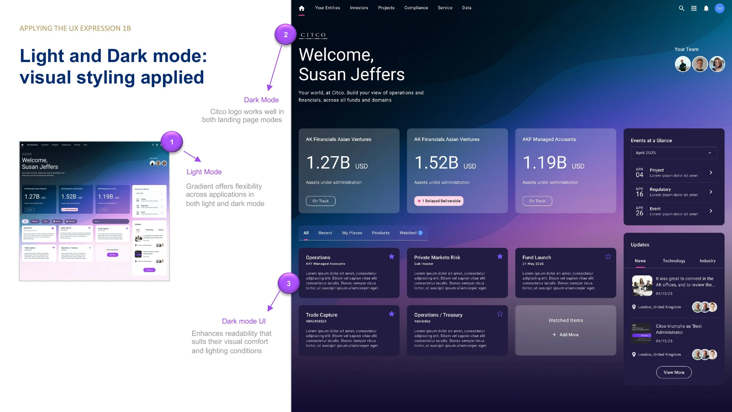
Applying the System to Real Product Screens
Once the direction was selected, I applied the visual language to high-fidelity product screens, including the Citco One dashboard.
Design principles included:
• Gradient-driven identity that scales across light and dark modes
• Clear hierarchy for financial metrics, updates, and operational tasks
• Modular card layouts that support scalability across domains
• Human touches such as team avatars and updates to balance enterprise data with relationship context
• Accessibility-compliant color scales and typography
All components were designed with MUI alignment to ensure engineering feasibility and future design system scalability.
From Moodboard to UI
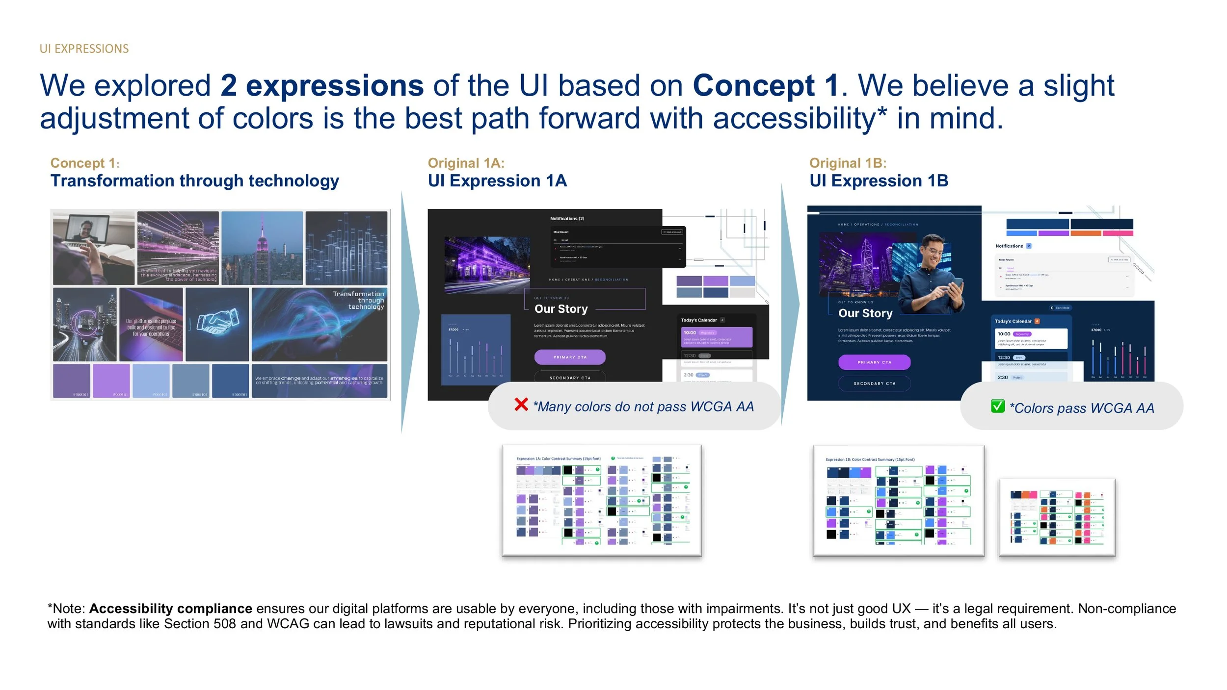
Citco had already aligned on “Concept 1: Transformation Through Technology.” Our role was to take that high level idea and translate it into a clear, usable interface.
We created a set of UI explorations to understand how color, typography, imagery, and components would come together in the product. Instead of jumping straight into final designs, we used these stylescapes to align with leadership on the overall direction.
We then refined the color system and ran WCAG AA contrast checks to ensure the design was accessible and ready for enterprise use. Once approved, the direction was applied to high fidelity screens across both light and dark modes.
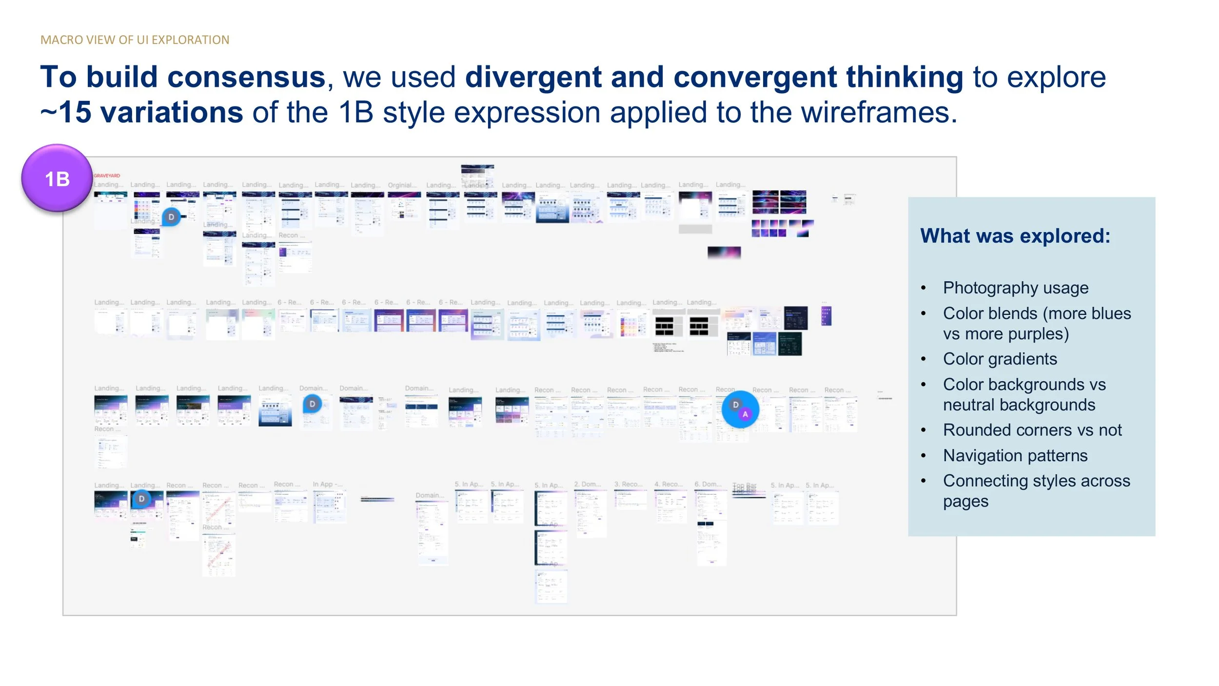
Exploration of multiple UI directions to evaluate visual style, layout, and component patterns.
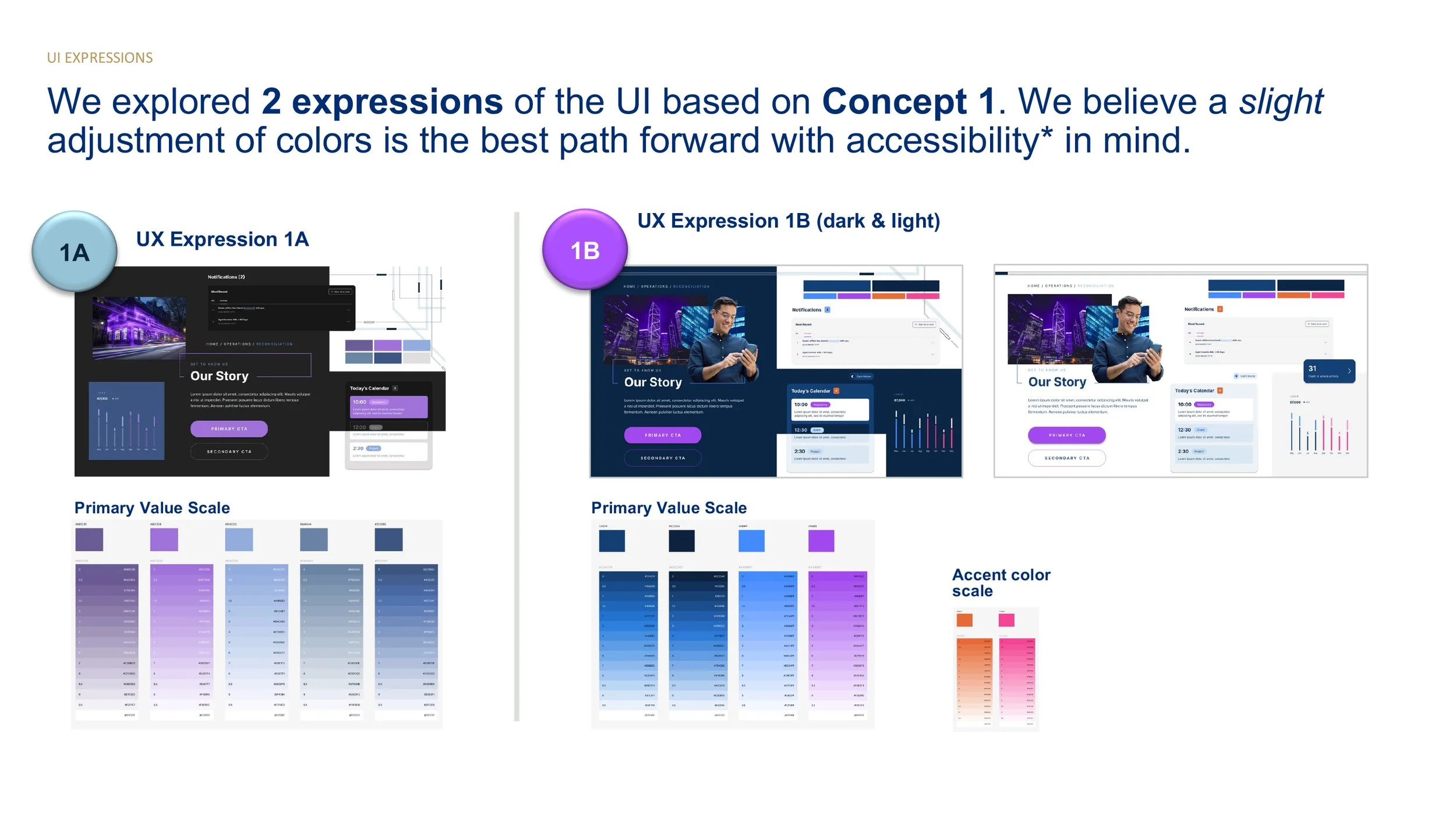
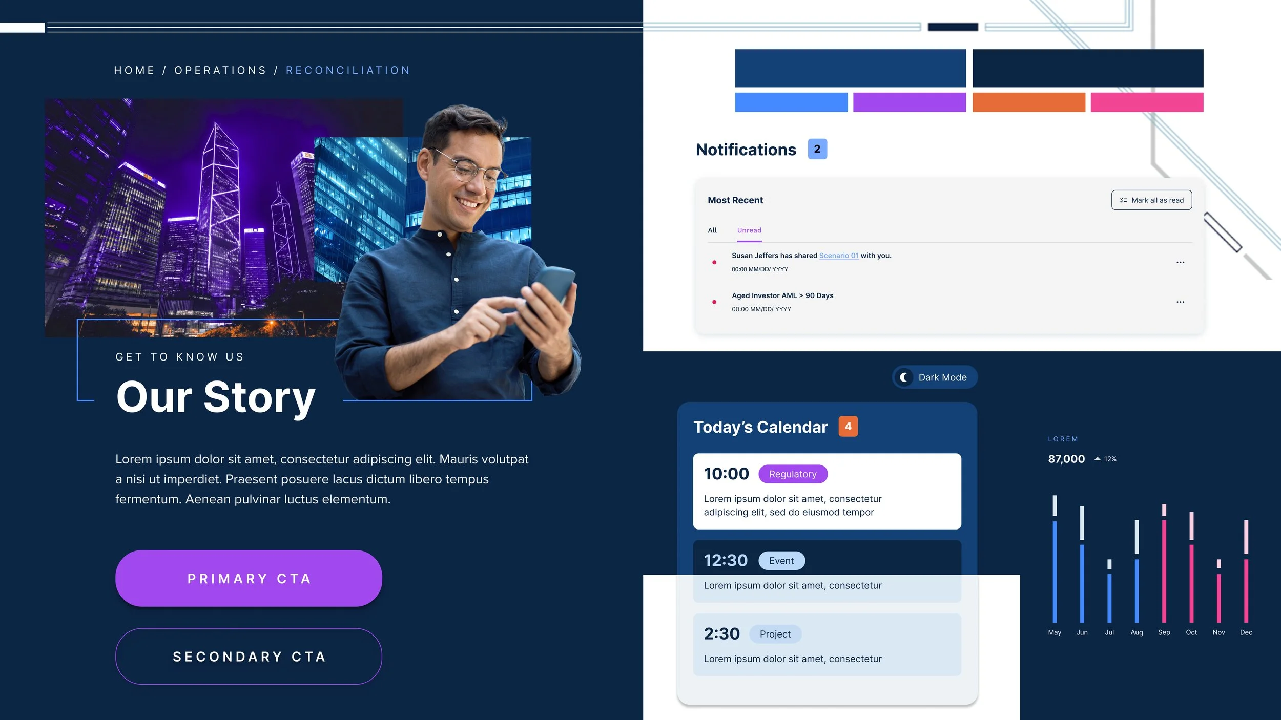
Two final UI directions showing different approaches to color, contrast, and hierarchy. Direction 1B was selected and became the foundation for the final UI.
Applying the design direction across the product
We applied the selected visual direction across key areas of the product to ensure consistency and scalability. This included both light and dark modes, allowing the experience to adapt to different user preferences and environments.
The selected design direction applied across key product surfaces in both light and dark modes.
Designing for Dual Themes (Light and Dark Mode)
We designed the system to work seamlessly in both light and dark modes. This required careful attention to contrast, hierarchy, and color usage to ensure readability and consistency across themes.
Rather than treating dark mode as an afterthought, both themes were considered from the start.
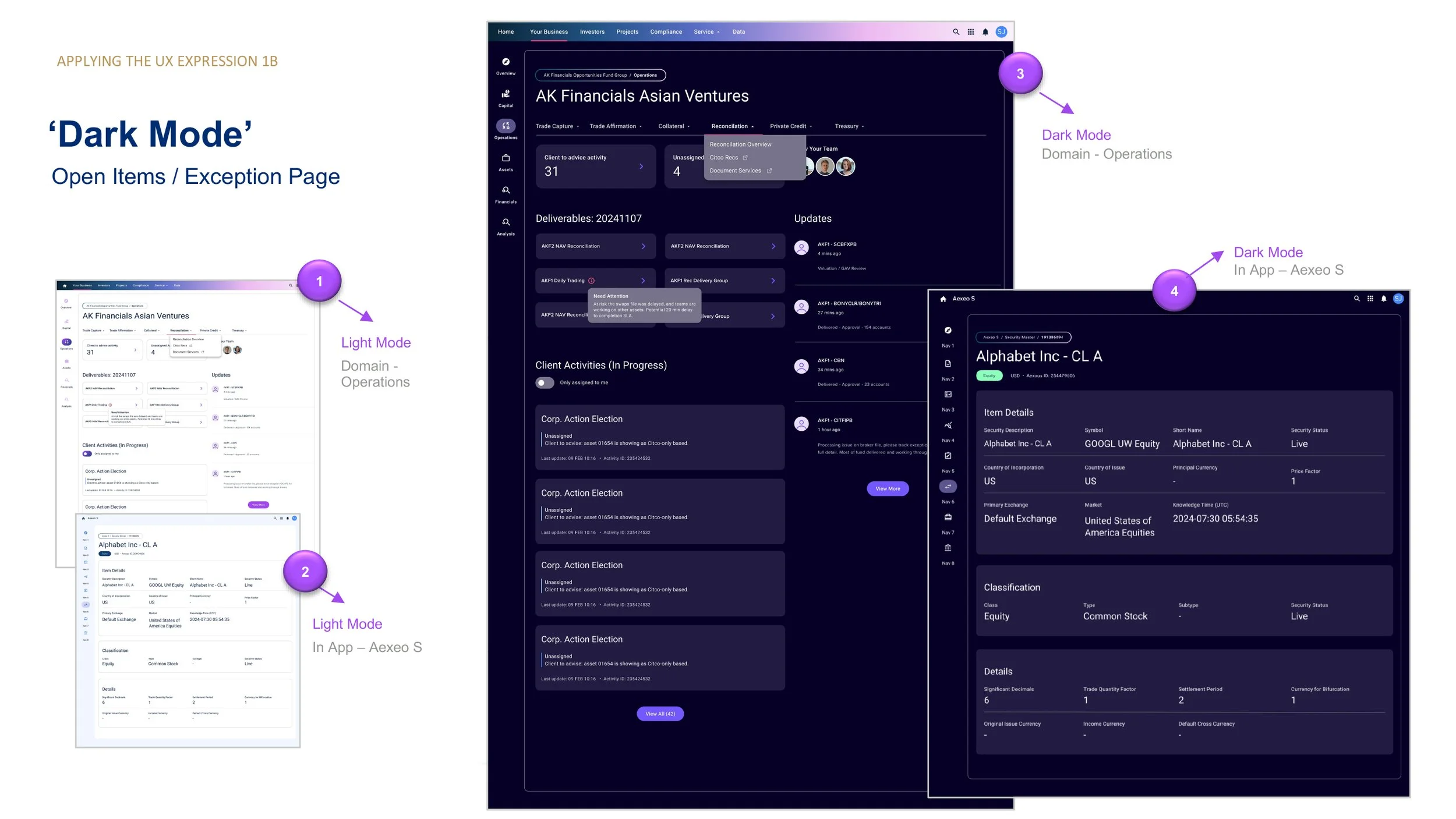
Light and dark mode implementations showing consistent structure, hierarchy, and component behavior.
Applying the system to real workflows
We applied the design system to real product workflows, such as exception handling and open items. This helped validate how the visual system performed in complex, data-heavy scenarios.
The goal was to ensure clarity, reduce cognitive load, and support task completion.
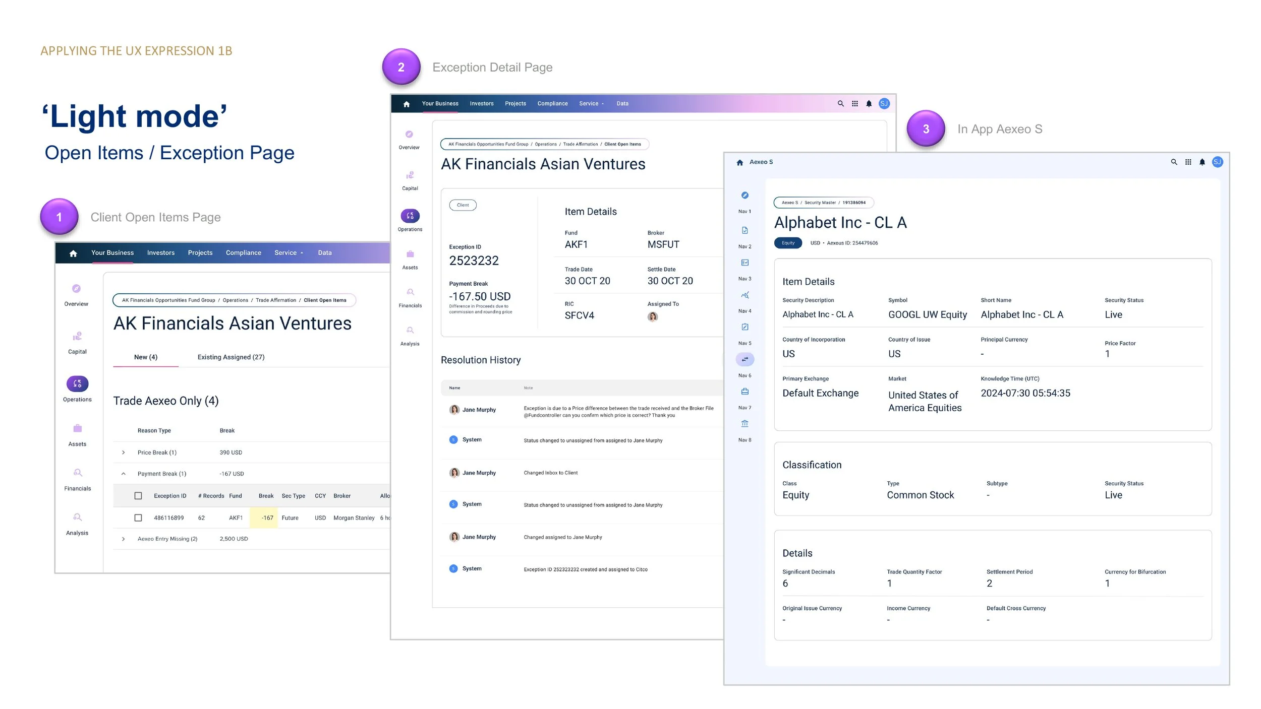
Example workflow screens showing how the design system supports complex operational tasks.
Designing a scalable navigation system
We introduced a flexible navigation model that supports multiple domains, services, and user contexts. This structure makes it easier for users to understand where they are and move between related areas.
The system balances global navigation with contextual, task-driven views.
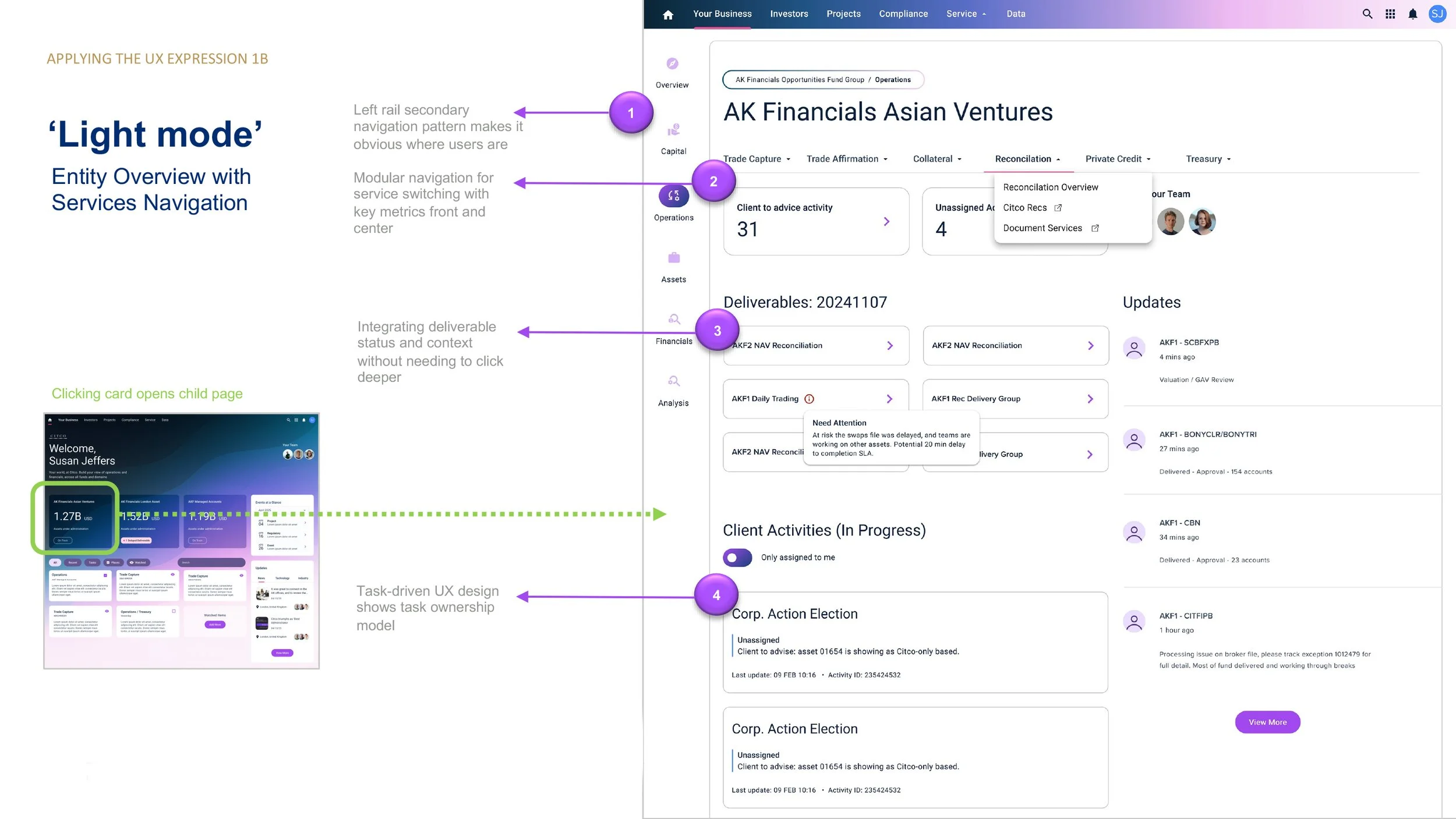
Navigation system designed to support multiple domains, services, and workflows.
Designing the core dashboard experience
The dashboard acts as the central entry point into the platform. It surfaces key metrics, recent activity, and actionable items in a way that is easy to scan and prioritize.
We focused on making important information visible at a glance while allowing users to drill deeper when needed.
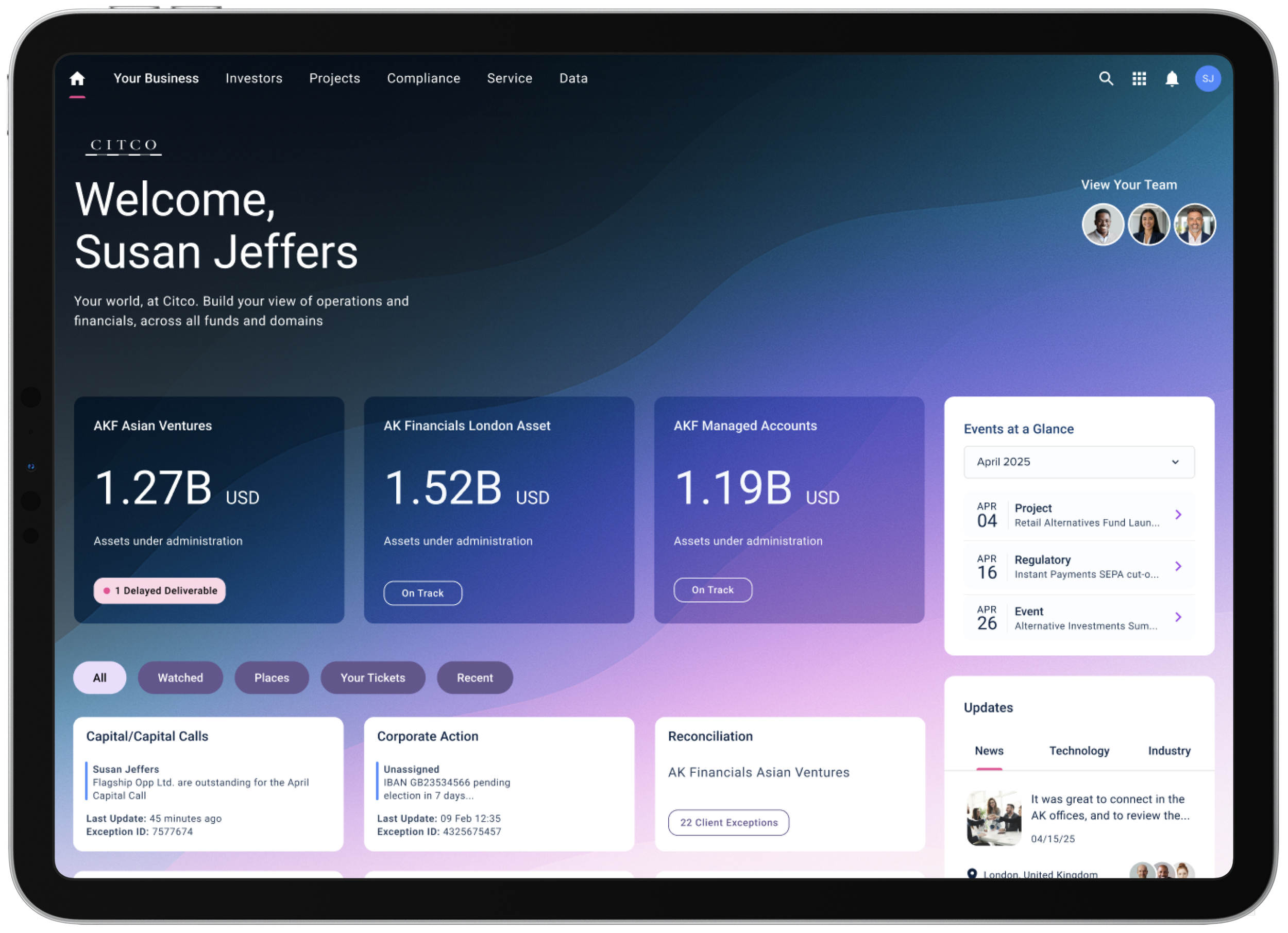
Dashboard experience designed to surface key insights and support quick decision making.
Improving accessibility and usability
We evaluated early design directions against accessibility standards and refined the color system to meet WCAG AA requirements.
This ensured the product is usable for a wider range of users while also improving clarity and readability across the interface.
Color system refinement to meet accessibility standards and improve readability.
IMPACT & LEARNINGS
This work helped bring clarity and structure to a product that was still taking shape. By defining key design decisions early, we gave the team a shared direction that could scale across features and workflows.
The introduction of a consistent visual system, reusable components, and alignment with MUI allowed design and engineering to move faster without sacrificing quality. Supporting both light and dark modes from the start also ensured the experience was flexible, accessible, and cohesive across environments.
Just as importantly, this project reinforced the value of focusing on the fundamentals before scaling. Establishing clear patterns for navigation, layout, and components reduced complexity and made future design decisions easier.
Key takeaways:
Clear design principles create alignment and reduce rework
Designing with development in mind improves speed and scalability
Accessibility should be built in from the start, not added later
A strong foundation makes it easier to expand the product over time